Alive Method
Brand Style Guide
Identity, voice, and usage
What Method Is
Method is a marketing and advertising company. Creativity is its primary tool, applied to strategy, experience, and design for companies that know what problem they're solving and why they're hiring an agency to solve it. It isn't a technology company, a consulting firm, or a creative studio in the precious sense. It's a marketing and advertising company that happens to be exceptionally good at the creative work that makes marketing real.
What Method Feels Like
The settled future. Not science fiction, not a concept car. The tomorrow that's already here, in its everyday state. Quiet confidence. Equipment that works so well you stop noticing it's technology.
Underneath the precision there's life: small moments of discovery for anyone curious enough to look. The surface says we're serious, we stand for something. The depth says we love this, and we built more than you expected.
Temperature
Method is cool. Blue accents. Blue-black darks. Silver text on dark, carbon on light. The temperature is the brand’s loudest visual statement; before you read a word, the coolness tells you where you are.
The coolness is deliberate and total: blue accents, blue-black darks, silver on dark and carbon on light. Nothing here is neutral by accident. The cool is the signal.
Logo System
Method uses a four-tier lockup system. Each tier serves specific contexts and has defined scale boundaries. Use the correct tier for the context; don’t scale a larger tier down when a smaller tier exists. The mark is an organic, fluid form: a molecular topology, resolved. The seams are gone.
Full Lockup
Primary brand signature. Bordered rectangle with the mark breaking the frame at top-right, “ALIVE” text inside, and the “Method” wordmark to the right in bold. The break is intentional: Method’s work is alive, not contained. Both variants have baked backgrounds.
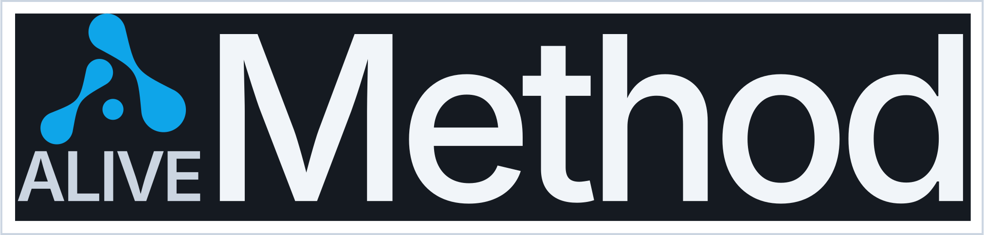
Full Lockup · Dark (baked background)
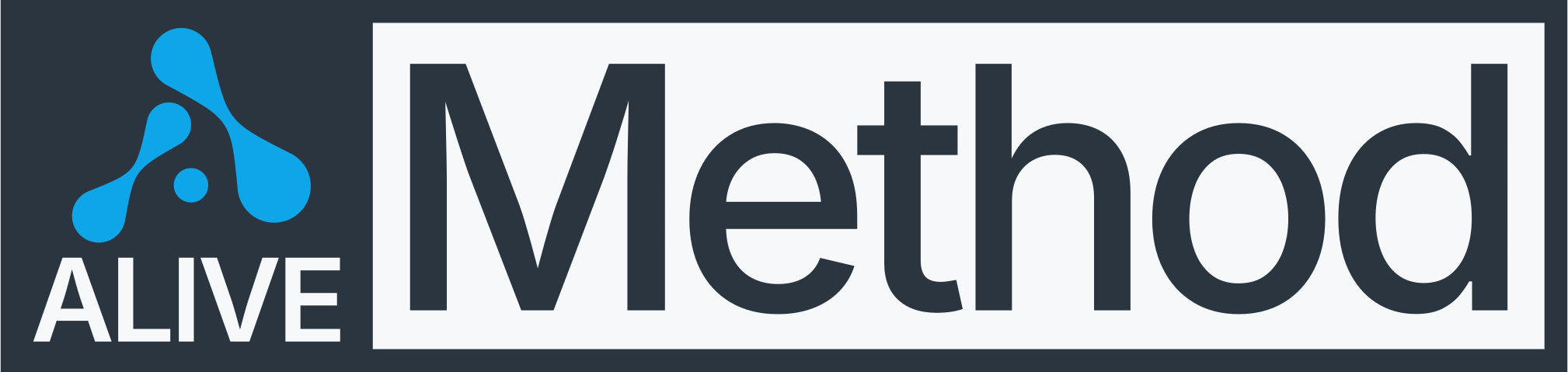
Full Lockup · Light (baked background)
Standard Lockup
The everyday workhorse: websites, emails, documents, presentations. Mark + “Method” wordmark, no border, no ALIVE. Transparent background.

Standard · Dark (on dark surface only)

Standard · Light (on light surface only)
Square Lockup
Social media profiles, app icons, constrained square contexts. Mark stacked above “Method”.
Square · Dark
Square · Light
Min Lockup
Favicons, badges, small UI elements. Signal-colored square + text label. The color carries the brand when the form can’t. This is the floor; do not scale any lockup below Min size.

Min · Dark

Min · Light
Method has no pre-composed Social tier yet. For avatars, place the Square lockup on a solid Void or Ice background at the platform’s dimensions. “Alive” is heritage, not the primary identity: it appears only in the Full Lockup and drops entirely at smaller tiers. Method stands on its own.
Logo Usage, Don’t
These are the most common misuses. Every violation degrades the brand.
Dark variant on light surface, wordmark disappears
Scaled below minimum, details lost
Stretched, never distort aspect ratio
Busy background, use a baked variant or solid backing
Recolored, Signal is non-negotiable
Compressed, never squeeze vertically
Color per Lockup
Method’s dual-token accent is strict: Signal #0770AD is light-mode only, Signal Bright #0EA5E9 is dark-mode only. Never swap them.
| Context | Mark | Wordmark |
|---|---|---|
| Light backgrounds | Signal #0770AD | Carbon #2B353F |
| Dark backgrounds | Signal Bright #0EA5E9 | Ice #F1F5F9 |
| Single-color (light) | All Carbon #2B353F, only when full color is impossible | |
| Single-color (dark) | All Ice #F1F5F9, only when full color is impossible | |
Scale Rules
Use the correct tier for the display size. Don’t scale a larger lockup below its minimum; switch to the next tier down. Clear space is 1× the mark height on all sides (measured from the border rectangle on the Full Lockup, from the colored square on the Min).
| Tier | Display Width | Use |
|---|---|---|
| Full | 240px and above | Pitch decks, formal covers, hero moments |
| Standard | 160–400px | Site headers, email signatures, documents |
| Square | 120–300px | Social media, app icons |
| Min | 64–120px | Favicon, badges, small UI |
Below Min size: scale the Min Sm export on display (CSS width). Do not use other tiers at this size.
Known production note: the light Full Lockup bakes a #F6F8FA frame background rather than Ice #F1F5F9. Flagged for the next logo refinement pass; treat Ice as the canonical light surface everywhere else.
Color System: Silicon Morning
Method’s palette is named Silicon Morning: the light before the day starts, when everything is clear and still. Cool, precise, quietly confident. Settled futures run at low temperature; they don’t need heat to prove themselves.
Identity Colors
Signal shifts value between modes, not hue. Both live in the same ~200° family at different brightness levels. The darker value says precision, the brighter value says beacon. Both say Signal. Never swap them across modes.
Dark Surfaces
Light Surfaces
Text Colors
On Dark
Ice #F1F5F9 · Headlines, 17.4:1
Mercury #CBD5E1 · Body text, 12.8:1
Pewter #607080 · Secondary, 3.5:1 (large/secondary only)
On Light
Carbon #2B353F · Headlines, 11.4:1
Gunmetal #4A5568 · Body text, 6.9:1
Pewter #607080 · Secondary, 4.7:1
Pewter appears in both modes intentionally. The same token doing the same job on either side of the theme is a structural choice that reinforces the system’s internal coherence.
Structural Element
Carbon is Method’s primary text color and structural anchor. It grounds the whole system: if something feels ungrounded, Carbon is missing.
Semantic Colors
All semantic tokens pass WCAG AA on their home surfaces. Light-mode semantics are slightly cooler to sit comfortably on Ice; dark-mode semantics are brighter to hold readability on Void. Keep the palette disciplined: stay within the Method tokens defined here.
Typography
Inter is the primary typeface. Space Mono is the secondary face, reserved exclusively for code and terminal contexts. Method runs a narrow weight range (300–500) with tight letter-spacing: the typography of someone who’s thought about every word.
Type Scale
console.log(experience.state); // settled
Weight System
Method never goes above 500 in heading or body contexts. When it needs emphasis, it uses 500 against 400 body, not 700. The restraint is the point: nothing shouts, everything is deliberate. Method compresses the whole system into 300–500 and lets spacing do the differentiation.
| Context | Weight | Why |
|---|---|---|
| Display (48px+) | 300 | Light at scale reads as composure |
| Section heads | 500 | The working weight; present, not loud |
| Subheads / cards | 500 | Same weight, differentiated by size and spacing |
| Body | 400 | Quiet by default; density over presence |
| Emphasis | 500–600 | Weight contrast, not boldness |
| Buttons | 500 | Confident without insistence |
Components
How the tokens combine into actual UI elements. Every component uses Method’s motion, color, and type tokens. Hover, click, and tab through these to feel the interactions: nothing snaps, everything glides.
Buttons
Dark mode. Hover and click to feel the motion.
Light mode. Primary switches to Signal #0770AD.
Primary
Signal Bright with Void text on dark; Signal with white text on light. Hover brightens slightly and lifts 1px. Press eases to 0.98, and glides back. For primary CTAs.
Secondary
Transparent with Slate border, Signal Bright text. Hover cools the border to Signal Bright and adds an 8% Signal tint. For secondary actions.
Ghost
No border, Mercury text. Hover brightens to Ice with a subtle white background. For tertiary actions and navigation.
Cards
Standard Card
Slate surface with a 1px border. Hover brightens the border from Slate to Pewter. Emphasis is luminance, not elevation: no shadows, no lift.
Featured Card
3px Signal Bright left border signals importance. Same hover behavior. The accent is the differentiator.
Corner radius: 4px for small chrome (buttons, inputs), 8px for cards and modals, 12px for large surfaces. Corners are softened by engineering, not friendliness. No fully sharp corners, no exaggerated radii. Dark elevation comes from borders and spacing, never shadow stacks: Void → Deep Silicon → Slate, with 1px Slate borders carrying the separation.
Inputs
Focus to see the Signal Bright border and glow ring (3px at 12% opacity). Input size is 16px minimum, prevents iOS zoom on focus.
Motion Language
The name is “Alive.” Motion is where that name becomes literal. Method’s motion is composed and inevitable: things appear where they belong, without drama. Transitions feel like the interface was always going to arrive at this state. Method doesn’t snap. It glides.
Easing Curves
Hover over the boxes to see each curve in action.
ease-method-glide
Smooth, composed arrival
ease-out
Standard departure
ease-in-out
Repositioning
Duration Tokens
| Token | Duration | Use |
|---|---|---|
| instant | 100ms | Hover states, toggles, micro-feedback |
| fast | 200ms | Button press, small transitions |
| normal | 300ms | Standard transitions (fade, slide); Method’s default |
| slow | 500ms | Page transitions, large element moves |
| deliberate | 700ms | Hero reveals, cinematic entrance |
Default pairing: --duration-normal + --ease-method-glide for everything. Method motion is slow and smooth by default. No springy or bouncy easings, ever.
What Moves & What Doesn’t
Always Animate
Page/section transitions, modal open/close, hover states, content loading skeletons, navigation state changes. Idle motion is permitted as quiet ambient awareness: background activity that suggests the system is alive. Not performing, just running.
Never Animate
Text content appearing (no typewriter effects), scroll-triggered content blocking, brand color changes (Signal doesn’t pulse or breathe), logo animations (unless specifically approved). Stillness is as valuable as motion; don’t animate just because you can.
Voice & Tone
Method doesn’t explain itself more than once. It doesn’t hedge. It doesn’t use ten words where five work. It speaks like someone who’s done this before and doesn’t need you to know how many times. Not cold: there’s warmth in competence. No performance of intelligence. Just intelligence.
We’re not your average agency. We do things differently.
The work is the only proof that matters.
Unlocking growth through data-driven creative synergies
Marketing, built by people who know why it works.
Our full-service team delivers end-to-end solutions across strategy, design, development, and digital marketing for businesses of all sizes.
Strategy, experience, and design. For companies that can say what they’re trying to achieve, and want it done right.
We’re passionate storytellers on a mission to transform brands through the power of creativity!
Method is a marketing and advertising company. Creativity is how the work gets done, not a department. We take on work where the outcome matters, the experience matters, or both.
Oops! Something went wrong. Don’t worry, our team of wizards is already on the case!
That didn’t go through. Try again in a moment; if it keeps happening, we’re already looking at it.
Voice Rules
| Method Does | Method Doesn’t | |
|---|---|---|
| Confidence | States it once, plainly | Repeat, hedge, or over-explain |
| Brevity | Five words where five work | Ten words where five work |
| Warmth | Warmth in competence | Cold minimalism or performative friendliness |
| Humor | Dry. A raised eyebrow, earned by being steady first | A wink, forced fun, exclamation marks |
| Intelligence | Is intelligent | Perform intelligence |
What Method Never Sounds Like
A startup trying to sound bigger than it is. A corporate deck full of jargon and hedging. An agency that says “we’re different” and then shows you the same case study grid. Method sounds like the person in the room who doesn’t talk first but says the thing everyone remembers. A product that doesn’t need a tutorial. Confidence that doesn’t require your agreement.
CTA Language
Don’t
“Unlock your brand’s potential” / “Start your journey” / “Book a discovery call” / “Learn more about our innovative approach”
Do
“See the work” / “Start the conversation” / “Talk to us” / “Tell us what you’re trying to achieve”
Naming
“Method” is the brand name in body copy and product contexts. “Alive Method” appears in legal, formal, and disambiguating contexts. Never “AliveMethod” or “alive-method” as the brand reference, and never “Alive” alone.
Photography & Imagery
Cool, composed, environmental. Think editorial architecture photography, not stock photography. The camera should feel like it’s documenting a place where everything is already resolved.
Subject Matter
Clean workspaces and well-organized tools. Screens showing finished products, not process. Architectural details: clean lines, natural materials, good light. People in natural, unposed moments, never stock-smile.
Treatment
Cool color grade (shadows shift toward blue-gray, never amber). Even lighting, avoiding dramatic shadows. Medium depth of field, because context matters. High tonal range with nothing crushed or blown.
What Method Imagery Is Not
Stock photos of teams high-fiving at a whiteboard. Abstract tech backgrounds (neural networks, circuit patterns, glowing grids). Warm, cozy, lifestyle-graded scenes; warmth is the wrong temperature for Method. Anything that could be on another agency’s site without anyone noticing.
Atmosphere & Gradients
Cold light has a direction. Method’s atmospheric effects should feel like morning light entering a still room: present, directional, unhurried. Never applied uniformly, never performing.
Signal Depth
Signal Bright at 4–6% opacity, centered on a focal point. A cool presence, not a glow. For hero sections and focal moments.
Morning Edge
Mercury at 3–4% from the top edge. Cold light entering from above, the silicon morning itself. For section openings.
Void Vignette
Void → Deep Silicon → Void. Content sits in the lighter center. A spotlight without literal light.
Rules
Atmospheric, not decorative. If a gradient is the most noticeable thing on the page, it’s too strong.
Maximum one gradient per viewport. Two competing gradients create visual noise.
Signal never appears as a solid gradient. Only at 3–8% opacity as depth or presence.
Gradients don’t animate. The stillness is the point.
Use CSS gradients. radial-gradient and linear-gradient with color-stop percentages.
CSS Token Reference
Copy-paste ready. These custom properties form the complete token set for the Method design system.
:root {
  /* Identity */
  --accent-light: #0770AD;   /* Signal, light mode only */
  --accent-dark: #0EA5E9;    /* Signal Bright, dark mode only */

  /* Dark Surfaces */
  --surface-primary-dark: #0C1017;    /* Void */
  --surface-elevated-dark: #151A21;   /* Deep Silicon */
  --surface-card-dark: #263545;       /* Slate */

  /* Light Surfaces */
  --surface-primary-light: #F1F5F9;   /* Ice */
  --surface-tinted-light: #CBD5E1;    /* Mercury */

  /* Structural */
  --carbon: #2B353F;

  /* Text: Dark Mode */
  --text-primary-dark: #F1F5F9;    /* Ice */
  --text-body-dark: #CBD5E1;       /* Mercury */
  --text-secondary-dark: #607080;  /* Pewter */

  /* Text: Light Mode */
  --text-primary-light: #2B353F;   /* Carbon */
  --text-body-light: #4A5568;      /* Gunmetal */
  --text-secondary-light: #607080; /* Pewter */

  /* Borders */
  --border-light: #CBD5E1;   /* Mercury */
  --border-dark: #263545;    /* Slate */

  /* Semantic */
  --error-light: #B91C1C;
  --success-light: #047857;
  --warning-light: #B45309;
  --error-dark: #F87171;
  --success-dark: #34D399;
  --warning-dark: #FBBF24;

  /* Motion */
  --ease-method-glide: cubic-bezier(0.25, 0.46, 0.45, 0.94);
  --ease-out: cubic-bezier(0.16, 1, 0.3, 1);
  --ease-in-out: cubic-bezier(0.87, 0, 0.13, 1);
  --duration-instant: 100ms;
  --duration-fast: 200ms;
  --duration-normal: 300ms;
  --duration-slow: 500ms;
  --duration-deliberate: 700ms;
}